An Interview with Luiz Stockler – filmmaker, storyteller, people-watcher

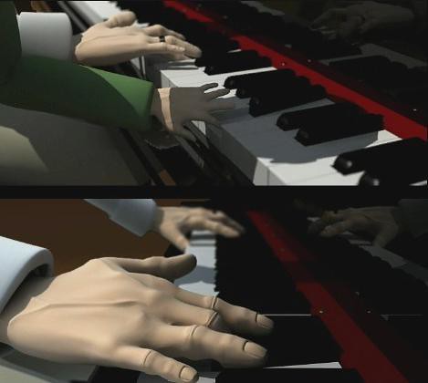
Luiz Lafayette Stockler is a 25 year old award winning director and animator. I recently discovered his film Vovô on Vimeo and was immediately struck by the powerful simplicity and the beautiful way the story is told. I have been lucky enough to find some incredible work on Vimeo just recently and Luiz’s film is most certainly in that category.


Vovô from Luiz Lafayette Stockler on Vimeo.


I managed to track Luiz down and he was kind enough to answer some questions about his film and his own process of storytelling.

You say in your Twitter profile “North Wales via Brazil” – what’s the story there?

I was born in Rio de Janeiro, Brazil to a Brazilian father and a Welsh mother. My parents worked with horses and were professional showjumpers who competed at the highest level in south america. when I was 8 years old, my dad was offered a job in Scotland riding horses for a breeder, so we moved to the UK. my dad has since moved back to Brazil.

You are soon to start at the London Royal College of Art – what are you studying?

I am starting an MA in Animation at the Royal college of Art, it’s quite a prestigious school in the animation world so I was ecstatic when I was offered a place!

Your short animated film Vovô has caused quite a stir online, what do you enjoy most about your film?

I think the one thing I enjoy the most out of my film is that its such a personal story to me, but also something that I think anyone can relate to in some way or another. It has a universal theme that makes it accessible to people.

Vovô has quite a sad story to it, is the film something you have created out of personal experiences or is it purely fiction?

Vovô is the Portuguese word for grandfather. The film is about my childhood memories of my grandfather when I was growing up in Brazil, up until his untimely death during a summer holiday I spent back in Rio visiting my family when I was 19, I havent been back since.

What sort of time did you dedicate to the Vovô project? Does it take a long time to create something so polished?

It was made during my third year of my BA in Animation at the University of Wales, Newport. I had the whole year to work on it from development/pre-production/production/post production to finished piece….the script was the easiest part, I wrote that in a day and took about 5 drafts to get it right, I got a lot of help and feedback from my friends which helped a lot…the rest of the film went through so many changes and doubt/insecurities that I almost gave up and considered re-doing the year. Because of its personal element it became very easy to lose sight of what I was trying to make. I think as a filmmaker/artist/musician/writer etc… you can become quite precious of your idea and it can be quite hard to stand back and take a look at it with an open mind. I had all these storyboards and animatics that no longer made sense to me so in the end I had to become a bit ruthless with it all and I just let spontaneity take over and freestyled most of the film, animating it in six weeks. I wouldn’t recommend that to anyone though as I hardly slept, but I thrived on the pressure. luckily most of the scenes were fairly simple to animate, otherwise it would have taken a lot longer. the best thing I had throughout though was my friends/fellow classmates, without their help I dont think I would have made this film the way I did. I cant thank them enough.


Showreel 2010 from Luiz Lafayette Stockler on Vimeo.


How do you maintain a sense of self and originality when there is so much incredible work published these days? What advice would you give a young artist or illustrator about finding their own way of doing things?

I think I’ve always struggled with drawing things ‘well’, I’m terrible at proportion/perspective etc…so the only way I could put to paper what is in my mind is to simplify it by about a 100 times, I always say that my work is a bad version of what I saw in my head. I think the most important/useful advice I ever got given was to play to your strengths, I kept things simple because thats the way I’ve always worked in my sketchbooks. You can get excited by a new technique or visual style or even a software plug-in that you end up getting carried away with it and lose perspective on what you’re trying to do, you also lose that raw connection you had with your work in the first place. Keep it simple, play to your strengths and do what excites you.

Do you consciously strike a balance between the depth of the story and the way it is told?

When I was coming up with visuals, I was told by a friend that if something is being said then we dont need to see it everytime, it’s like we’re being told something twice. With this in mind, I tried to think less literal and more metaphorically and symbolically about what was on screen, I thought about how the viewer could learn so much more about the characters without being told, but rather shown. I also think it has something to do with songwriting, I’ve written songs since i was young so I’ve always been used to telling stories in a stripped down/brief way. The script of the film ended up being a progression of my songwriting.

Your film is centred around the relationships of two people and very focused on particular idiosyncrasies, what do you like about people-watching?

I’ve always been interested in people watching. I like how you can tell a lot about a person before you’ve even had a conversation with them. The way they walk, the way they dress, cross their legs, hold a cigarette etc… we show a lot of who we are using just body language and I think I have been good at mimicking that in people from a young age, I was always doing impressions of friends and family, copying their gestures and behavioural nuances – something which has definitely helped me when it comes to animating characters.

Do you have any projects you are currently working on that you can share?

I’m currently just saving money for my big move to London and the Royal College of Art. apart from that, I’m constantly doing illustrations and working on ideas for films, which you can see on my blog at http://luizstockler.wordpress.com

//

Many thanks to Luiz for sharing his thoughts and taking the time to answer some questions. Working with children in school around the issues in Luiz’s film can be difficult and as teachers we are often a central part of the support that can be provided to children who are dealing with personal loss. Perhaps this film could be used to help an open discussion around these sensitive and difficult times.

Of course at the heart of the film is the story and such a narrative could be explored more widely in terms of the way it is told, un-picking the brevity of narration and how it is paired with visual metaphor and symbols as Luiz explained.

I hope you enjoyed the film and hearing from Luiz himself, perhaps you will see a place for it in your own curriculum or to support the work you are doing with children. I am sure you will join me in wishing Luiz every success when he joins the Royal College this September and in his future work.

Benjamin Zander on Music and Passion

Today I have been in a primary school in Sunderland involved in an ambitious project involving TED talks. It made me recal this wonderful example of a passionate person speaking from the heart about something they hold dear. Benjamin Zander has been the conductor of the Boston Philharmonic Orchestra since 1979.

[he] has two infectious passions: classical music, and helping us all realize our untapped love for it — and by extension, our untapped love for all new possibilities, new experiences, new connections.

Oil’d – How Could Our Pupils Make an Animation Like This?

I’m fascinated by the representation of data using infographics. I like their bold visual approach and how the style and composition signals the content it is communicating.

Chris Harmon a designer and animator from the Greater New York City area created this beautiful and thought provoking animation called Oil’d. It explores how dependent we are to oil and how much was lost into the ocean from the Deepwater Horizon oil disaster.

Oil’d from Chris Harmon on Vimeo.

Just from the presentation of information about the oil spill we could go in many different directions with our classes.

  • Exploring he sources of information used
  • Verifying the accuracy of the data included in the film

However if we unpick the animation layer by layer we get a much better idea of the great skill with which Chris used to complete it. Wouldn’t it be great to have Chris in front of a class of students explaining how he went about creating the animation, the stages of planning and execution.

For me there are many elements and skills that would on their own make excellent projects for children to explore and be engaged in:

Data
The maths involved in comparing and cross referencing the data, and what so many good infographic do the data-metaphor, juxtaposing information against something we find easy to refer to. For example the number of plastic bottles inside the Empire State Building, which we know is big!

Authentic information and research
Finding accurate information and data would be another important skill that would challenge a student to create something equally authentic and meaningful. We have the tools with which to find huge amounts of information and data but we need to know how to filter it. I don’t think teaching children how to search is enough, that is the first step, it is how we then process that information that needs time to be demonstrated and improved.

Persuasion
With my literacy hat on this animation pushes us to consider the impact of oil on our lives and has a strong persuasive message. The art of persuasive writing and in this case the careful scripting would be great to develop in this sort of medium, perhaps about a local issue.

Animation
The artwork and animation are obviously professional, but there is much to explore about the use of colour to convey meaning and an overall message. The colour schemes remind me of the Breathing Earth which also depicts an environmental message. It would be good for children to explore symbols and how we might convey a message in a visual way – a comparison type task would fit well here.

I think this animation is a great example of the sort of cross-curricular, multi-skill outcome that should be challenging our pupils in our schools. Making an animated infographic film about a local issue would cover so much. Furthermore if you had the opportunity to involve expertise, like Chris Harmon’s, it would provide that spark that would spur such a project onwards even further.

How to Create an Emotion Graph using Google Forms

This idea was one that popped into my head at about 3am. After George, my 2 year old son, woke us and I had settled him again, I began thinking about Google forms (as you do at 3am – what better time to be thinking about that subject!!) and the current work we are doing on film narrative and The Piano by Aidan Gibbons. Take a look at the film for yourselves.

What is an emotion graph?

An emotion graph is a simple line graph comparing a range of happiness to sadness against different points (time) in a story or film. This technique of graphing the emotional ups and down within a story really helps children to visualise the whole story in a different way. Once the graphs are complete they can be discussed in reference to the different peaks and troughs of emotion. “Why is the main protagonist so upset at this point on the graph, what has happened?”, “In which part of the story is he the happiest?”

The graph can reflect the events in any type of linear narrative, whether that be a book or film – it could even reflect the varying emotions within an event such as a football match.

As you can see the whole plot in one graph it is useful to engage the children in conversations about the structure of the plot and the way that the emotions are tied into generic story elements such as problems, conflicts and resolutions.

comparison1

The children in my class really enjoyed watching The Piano today as we began our film narrative unit. One of the children said that the main character was playing his emotions on the piano, they were the notes of his life. Such a lovely turn of phrase. The Piano is an excellent text to explore in terms of an emotional graph as each of his memories linger, bringing joy and sadness into his life again.

Step by Step – make the form

  1. Create a new Google form
  2. Add a new question for each of the different events that you would like to gauge the emotions for. Because the film is only two and half minutes long I have chosen about ten or eleven events.
  3. Select “Choose from a Scale” question type and add the numbers 0 – 10. For each question, I added a reminder about the emotional scale from sad (0) to joyous (10) as some additional text. I found it really easy to generate one question and then just duplicate it using the link, and just edit what the event is.

Step by Step – create the emotion graph

Your form is complete and now you just need to add the line graph itself to the linked spreadsheet. You will see in your spreadsheet that the header (top) row is filled in with the different events from left to right.

  1. Under each column heading add the average =AVERAGE(Range) formula for the cells below, say down to 100 cells below. This will average out the different responses from your form and return a single figure. Don’t worry the survey results should always be added below your average row. I like to add the “Rounded” formatting to these cells as well.
  2. Select these average figures
  3. Click the “Insert Chart” tool and create a line graph from this data. (These average cells could also be hidden, select the row from the left and click hide row) Find some more detailed steps to making a chart here.
  4. Place the chart to the right of your data or embed within a blog post somewhere, and enlarge it so that it is clearly visible.

I will be emailing the emotion graphing form to all of our Year 5s and getting them to complete the form (from within the email) alongside watching the film again. We will then be reviewing the responses and how the emotions vary throughout the text. I will be encouraging them to justify their responses and decisions with supporting evidence from the film.

Now it is your turn to complete the emotion graphing survey that I have referred to – watch the film again, if you haven’t already, and answer the survey. The code for embedding a form is available when you click “Edit/Resend Form” and then it is under the “Preview and Send” link.

Screenshot 16

You will see that I have published the graph which can be done from within the graph drop down menu.

Let me know what you make of this idea and whether it was worth a sleepless early morning!

  • How can you use this idea in your own narrative or literacy unit?
  • Have you used emotion graphs? (I know there is an option with Turning Point voting systems to do something similar which I have used in the past)
  • How have you used them?
  • How else have you used Google forms in the classroom?